 26 Nov 2021
“Confused between Google\'s Flat Design & Apple\'s Material Design? Check out this comparison article by SynapseIndia & learn the pros/cons of both designs & more.”
What Is Flat Design?
Flat design is a style of interface design that dismisses the 3D elements of skeuomorphism. Though it does not give up skeuomorphism completely, it focuses on delivering objects in flat moderate form. It maintains a strategic distance from the extreme utilization of gradients, textures, and drop shadows intended to deliver 3D effects for less complex elements focusing on simple flat elements, typography, and flat color schemes.
The purpose of flat design is to streamline designs and make websites simple, faster, and effective. The concept of Flat design came to provide support to responsive design, as it helps in making the content of a website adaptable and adjustable to the device screen size. Its simple shapes and minimal elements reduce website loading time on all devices..png)
A few Flat Design Examples
Flat design has become a part of our daily life, specifically, iPhone users are using it almost everywhere. By using angular lines along with Apple’s application design interface and monochrome contrast, the output we get is gorgeous.
● Space Needle
Space Needle’s loading image obeys the design principle of minimalism: simple color & background, images, and texts. The entire website's background color has a pastel colors effect, which makes the central image even more attractive and recognizable.
● High Fashion Store
This clothing website has everything that its users may find attractive, high fashion with dynamic creative doodling. Simple colors of the background and buttons make it even more appealing.
Additionally, the designer has also added a light switch for two modes: light and dark.
● Fitbit
Its simple and soft colors are enough to show users that it's a flat web design. The icons lie at the bottom of the homepage and are arranged in a circle, following clean lines. When the user hovers over the icon, the color changes which helps in easy visual recognition.
● Geckoboard
Geckoboard website focuses on creating a TV dashboard that you can use for KPI data sharing with your team. Both the product interface and the website use flat design.
The light background displays simple plain graphics, icons, fonts, and product elements. The homepage has made interaction easy and recognizable with the changing of numbers using Sans serif typography.
● Mailchimp
As of now, everyone is aware of the popular marketing tool Mailchimp. It reprises its designs often. But this version of Mailchimp has a flat web UI with minimalist elements.
In the central mockup of the email template, everything needed in an email - such as fonts, texts, images, and buttons - is simplified.
● Uncluttered, distraction-free design
● High readability with clear typography
● Easily adjusted for responsive design
● Faster to load in browsers and apps
● Lack of depth makes elements looks less clickable
● Creative design and standing out is harder
● No design guidelines like other design systems
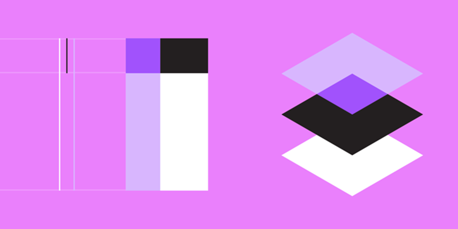
Known as the child of Google, the Material design came into inception to bring unified user experience across several devices, platforms, and input methods. Google used Material Design to provide a consistent experience to users, regardless of how users access their products.
The guidelines for Material Design specification cover almost everything like - typography, grids, space, scale, color, and imagery. Material Design is more than just telling designers how the end product will look. It allows designers to create designs with hierarchy, meaning, and focus on their results.
● RumChata
RumChata uses the physical aesthetics of Material Design to deliver an excellent user experience. It makes the interface simulate real-world things. Though it may look colorful at the very first glance, it seems intuitive.
● DropBox Business
DropBox Business has adopted the concept of Material Design since early times, the branded blue color is soothing and perfect for the material. The website has a single color palette with black and white incorporated as a background.
● Waaark.com
In light of the rules of animation effects, Waaark has created a good balance with elements and layout. With the help of mouse drag, users can exchange animation on the homepage intelligently and swiftly, which appears as though wave streams on the screen. This also complies with the movement rules in reality, and all progressions accelerate/decelerate step by step.
● Serioverify.com
Keeping in mind the guidelines of Google design, Serioverify has used the default altitude to give its upcoming users a sense of consistency. Furthermore, it allows the developers the authority to control the elevation of the element and projection by one single unit.
● PumperlGsund
As opposed to Dropbox Business, PumperlGsund has utilized light tones primarily, for certain less-perceptible colors in the background, and the remaining is set to highly contrasting.
● Benefits web designers at all stages
● It gives a comprehensive overview of the crucial components and behaviors of a UI
● A mobile responsive approach to design
● Intuitive interface improves user experience
● Flexible and empowering design system
● Adherence can lead to the resemblance
● Discourage freedom on exploring creativity in design
● Can be intimidating because of the emphasis on coding
● Design guidelines can cause issues for website speed
| Material Design | Flat Design |
| Material Design has three-dimensional or skeuomorphic properties. | Flat design does not have any skeuomorphic or three-dimensional properties. |
| Material design has a higher reactive/feedback response which makes it more interactive. | Flat design is for users who prefer interacting with the website. |
| Material design has a gradient added to it, which helps in creating a sense of depth. | The Flat design does not have a gradient added to it. |
| Material design uses Z-axis. | Flat design does not use Z-axis. |
| Material design serves complex needs. | Flat design is limited to simple needs. |
| The page loading speed of the material design is slightly heavier. | Flat design loads page easily and faster. |
The well-documented guidelines of Material Design by Google is the primary difference between the two. Google has clear instructions and principles. After every change, Google updates its document. But there is no such thing maintained for the Flat Design. It is just a name given to the minimalist approach of design by several designers and companies.
Timeline indicative is one of the easiest ways to understand these UI styles. Initially, there was skeuomorphism, then the innovation of Flat design happened. And by giving some outline and depth to the Flat design, the Material design came into existence.
Material design is by all accounts working effectively in keeping up with the advantages of Flat design while bypassing its setbacks. It implies that Material design is better since individuals would use it for similar reasons, as they would use Flat design. The plus point of using the Material design is it does not get bogged down in technical difficulties such as having a too flat interface makes it only superior to Flat design.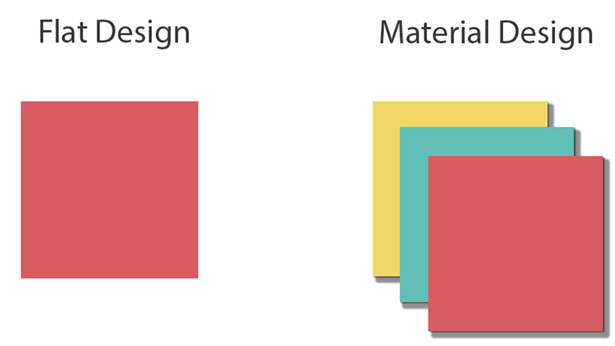
For most of the users, Flat and Material design are the two solutions for a similar problem. However, certain users will say Material design is the next step in solving the problem and hence fail to compare Flat design and Material Design.
Flat design is the turning point and a significant building block for contemporary UI design. Material design will attract designers in the upcoming future, but who knows when it will eventually evolve.
